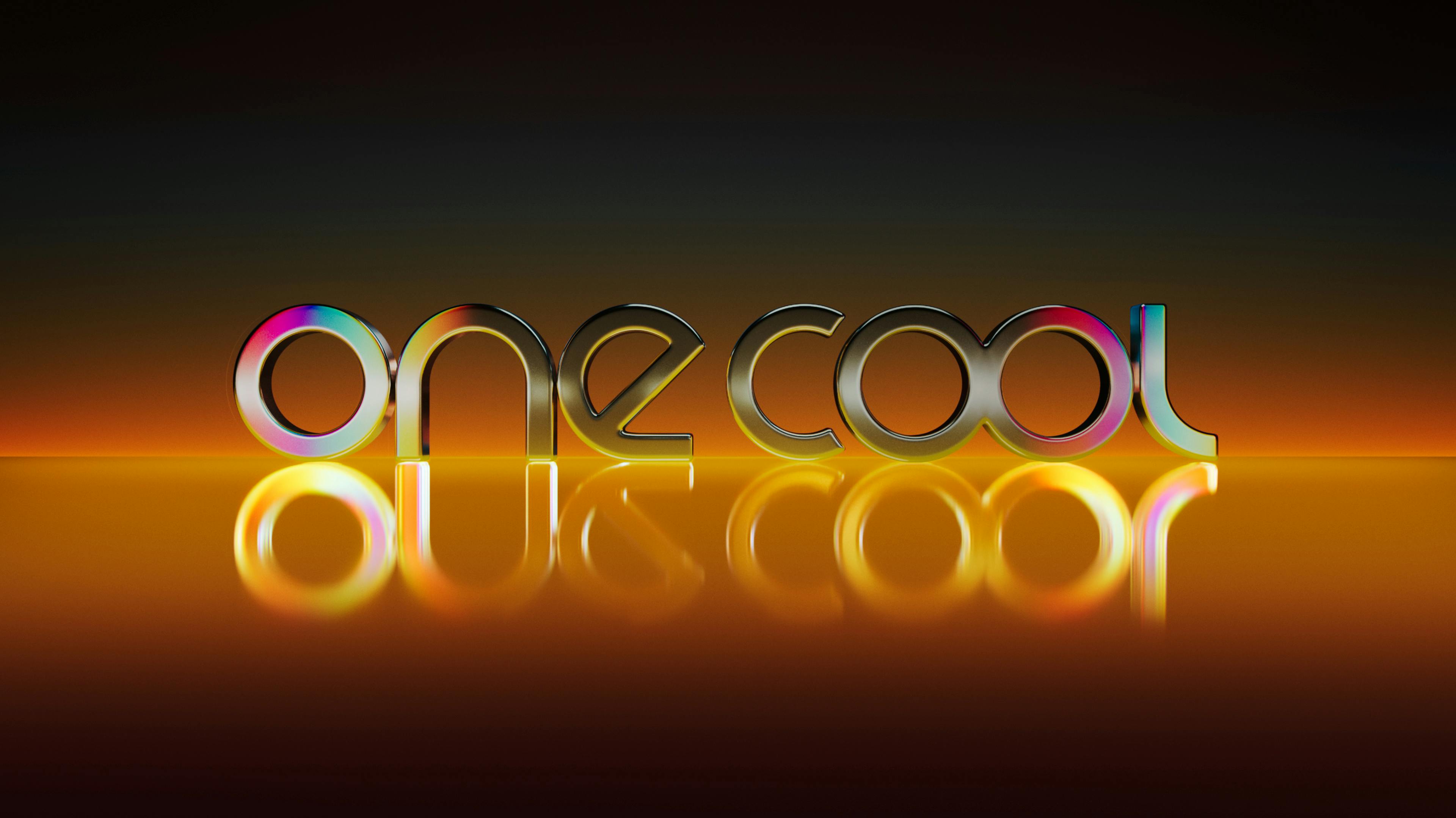
one cool
yU+co developed a modern, global, and versatile logo for One Cool’s brand refresh, while honoring the company’s history and staying true to their core identity. Given One Cool's diverse range of projects, we designed a logo that is both family-friendly and adaptable across various genres. The logo’s rounded appearance creates a warmer, more approachable feel, fitting for their broad array of projects.
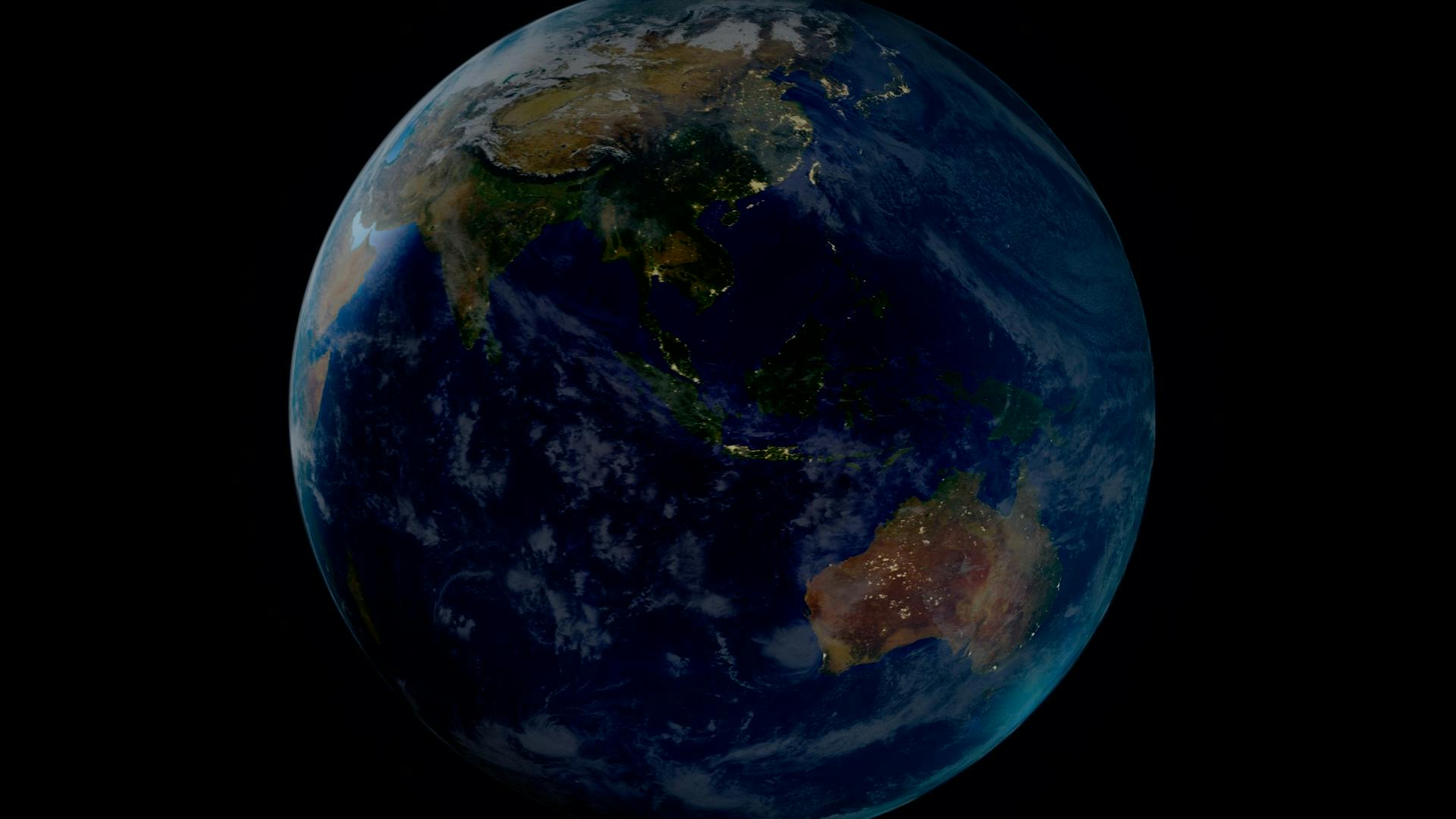
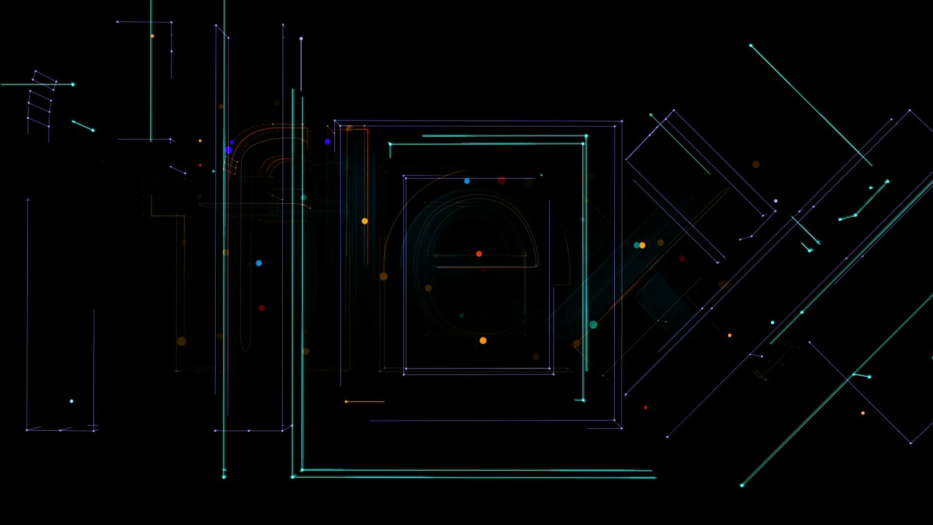
The two O’s connect to form an infinity symbol, a nod to One Cool’s vision of the earth, sky and boundless universe.One Cool Group was founded with a global vision, embracing all aspects of film from an international perspective. To convey this, we created a dynamic display of light inspired by ethereal elements. The disks circle the screen before converging and bursting to reveal the new One Cool logo in vibrant, colorful tones. This transition encapsulates the One Cool Group’s vision of global collaboration, with the array of colors symbolizing the diverse and unified creative energy that drives the company forward.