US Census
In a whimsical, fun branding initiative, yU+Co univels a :15 TV campaign targeted to — well, every adult and child in America. Working under the direction of DraftFCB, New York, the Census 2010 spots are part of a massive, integrated branding campaign that encompasses TV, print, outdoor and online; a media blitz that includes the work of eight different ad agencies and was produced in 28 different languages. In March 2010, census forms were mailed to households all across the nation.
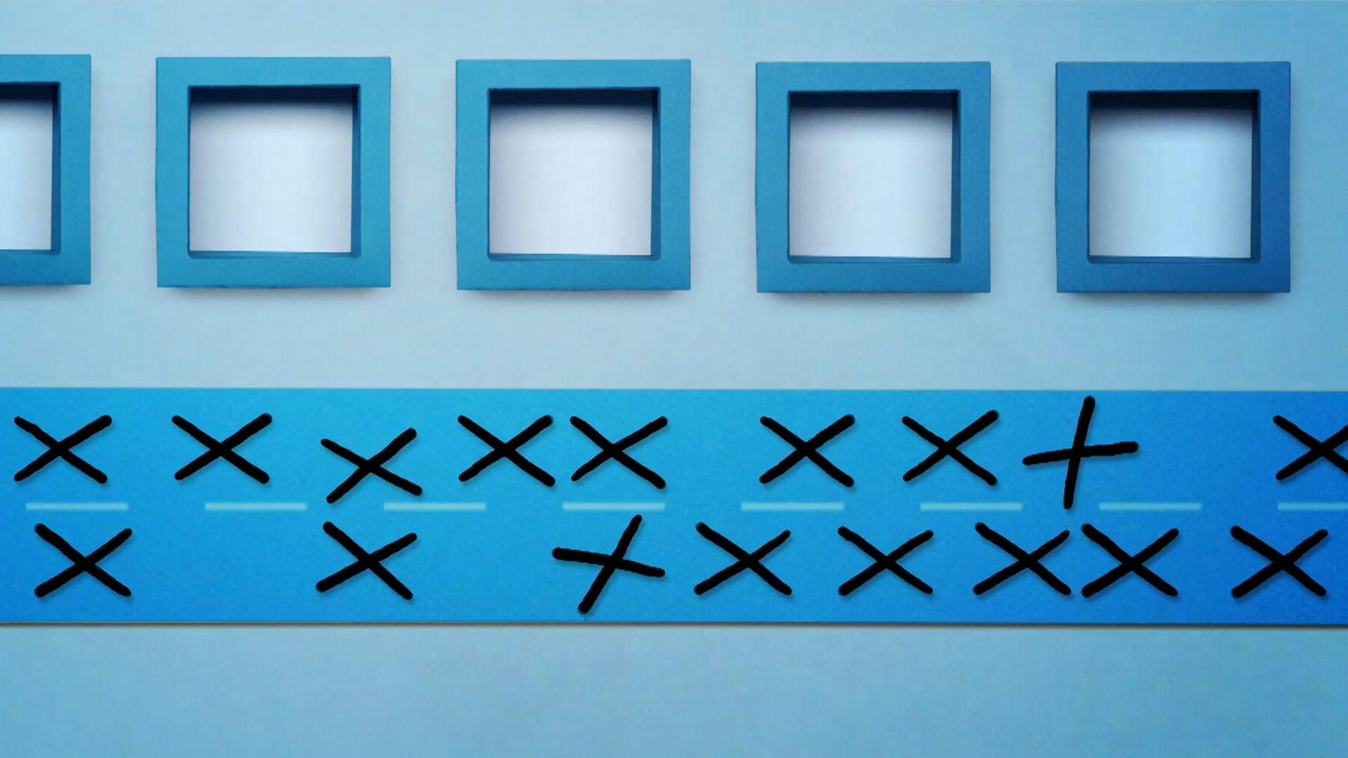
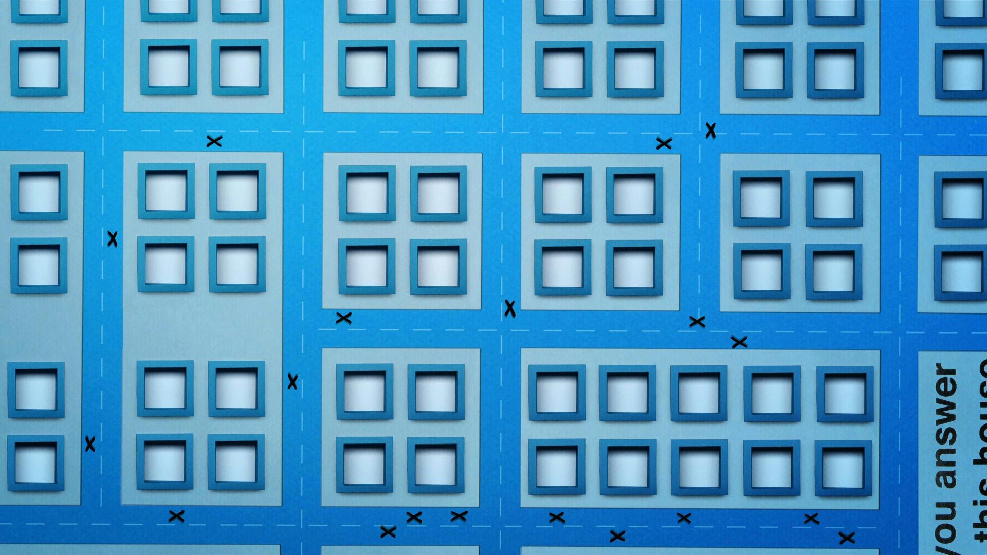
yU+Co was charged with developing key art in branding end logos and visual extensions that can be seen throughout the U.S. Census Bureau push. Besides informing the brand look and voice, the firm took on the monumental task of orchestrating the production of the multi-faceted campaign, run by DraftFCB. Through five :15 TV spots, the actual census form comes to life. In what look like paper cut-outs, elements of the form get up and move across the blue and white landscape of the mailer. Boxes, dots, punctuation marks and letters on the form become whatever the message dictates. Each spot is a visually striking, compelling tale with a beginning, middle and an end — all in fifteen seconds.
One of the many challenges in designing a graphic sequence that would accommodate any of the 28 different languages is that most of the translations required longer text to communicate the same message. Another consideration was in the languages, which read from right to left or used characters instead of letters. From a production point of view, it had to be very user friendly so that all of the teams could incorporate our graphics easily within their spots. Whether that involved slight variations on transparency, text size, length or speed of animation, we worked closely with each agency to provide a unique graphic for each individual need, while still maintaining the integrity of the core brand imaging and message.


